
One identity, every channel: replacing passwords at Levi’s
A passwordless experience built on one source of truth for identity.
SR. UX DESIGNER · LEVI STRAUSS & CO. · JUN 2025–AUG 2026
Overview
I led UX strategy for login and registration across the Global Levi’s Red Tab loyalty program, moving it from a password-based experience with many entry points to a passcode-first model built on one source of truth for identity. In rollout, login success rose from roughly 63-67% to 94-97% [CONFIRM source and timeframe], email subscription capture reached 96.48% in the US and rose from 66.3% to 75.61% in Canada, and password-reset dependency, which had driven hundreds of thousands of reset emails a year, was eliminated.
My role
I led cross-functional discussions and workshops, drove long-term strategy and alignment through thoughtful UX visual tools including concept mapping and prototypes, and designed and shipped patterns consistent and compatible with our global design system. I partnered with regional business teams, security, product and engineering.
The problem
Registration and login had grown into more than ten separate experiences across site and app [CONFIRM count]. Passwords were our biggest security vulnerability and a constant source of reset friction. Retail, over 70% of the business, shared no identity with digital. And the groups who owned each piece measured success differently: Security wanted fewer attack paths, Commercial and CRM wanted reach, members wanted speed.
I framed this as three goals that all had to be met: secure, good for the business, and valuable to the member. I also carried a lesson from the 2021 loyalty rebuild, which lacked a north star and drifted. This time I wanted the vision first.

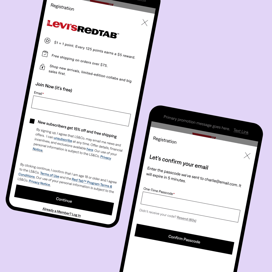
Registration before and after: a long form with a password became email only, with the offer in a checkbox beneath the field.
Building the north star
In September 2025 I ran a cross-team workshop with participants from across the loyalty platform and regional teams to map today’s shopper journey and a future ideal. It surfaced pain points by channel and three themes: progressive profiling, cohesion across channels, and connecting channels. That became a two-to-three year vision and, within it, an identity model.
The central question was what identifies a member across site, store, and app. I called the options “postures” and laid out the cost of each. Posture A: one identifier, email, everywhere. Posture B: members can start with email or phone, which risks two accounts for the same person that have to be merged later, a permanent build and support cost. Posture C, separate identities per channel, I named only so we could rule it out deliberately rather than discover it later as the accidental default.

Posture A (one email identity) versus Posture B (email or phone, with accounts to merge later).
Posture B was the appealing one. Leadership liked competitor flows that offered choice, Product liked the flexibility for members, and the business saw phone numbers as SMS reach. Commercial pushed hardest for it. My concern was that the gains could be sunk by the cost of identifying and merging accounts: members with fractured profiles and split rewards, bloated data for the business, and a permanent build for engineering, with retail’s deferred authentication the riskiest part.
So I designed a facade. Members choose how to identify and verify, but everything resolves to a single source of truth. It looks like B and works like A. I presented it as a working prototype that put each group’s open questions on the page, such as profile schema fields for the consumer profile service (CPS) and consent for legal, and the leaders in the room were happy with it. [FILL: optional quote or decision it unblocked]
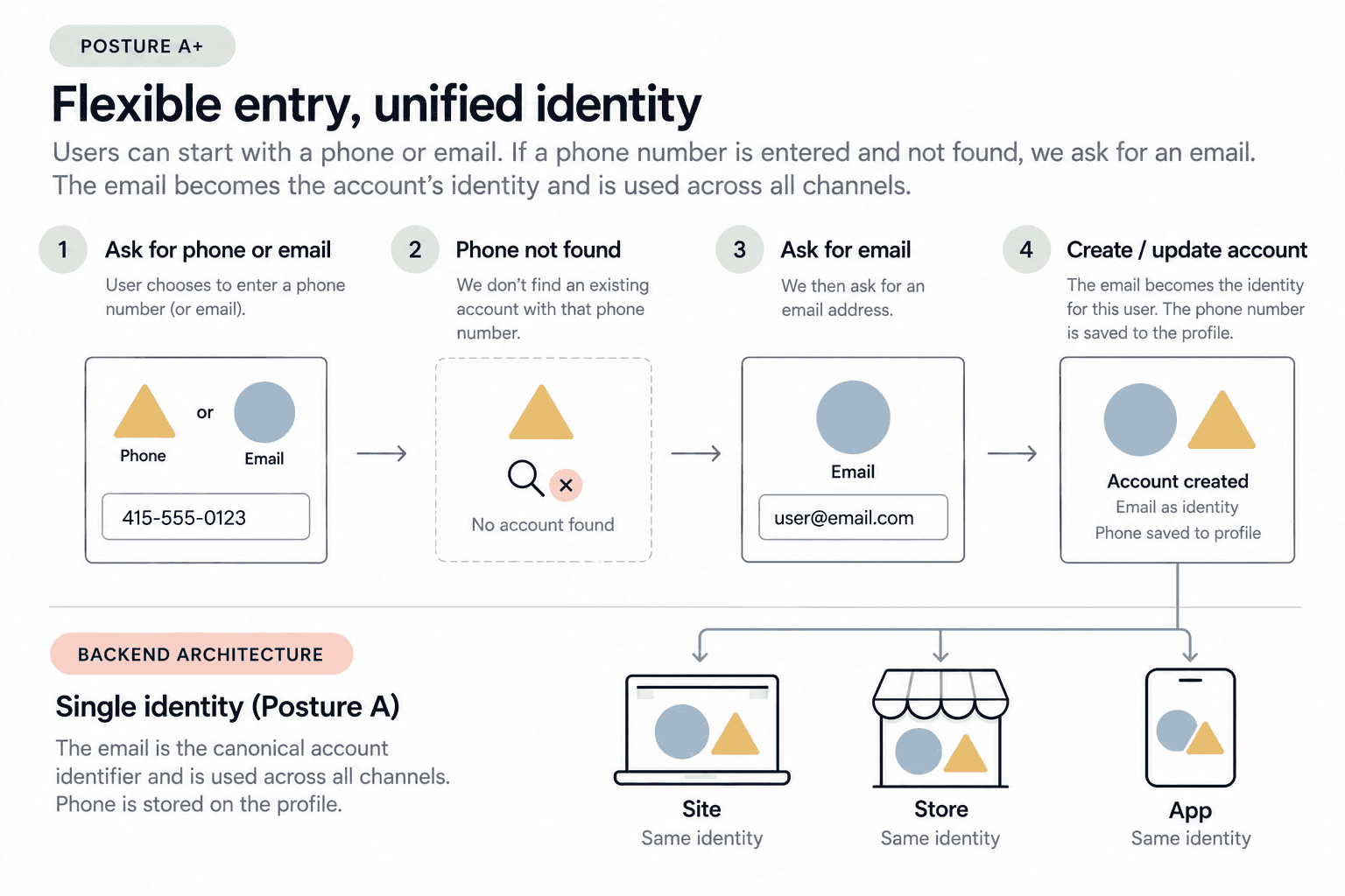
The facade: what the member sees (top) and what the system does (bottom). Phone or email in, one email-anchored identity out.

The north star prototype flow. Phase 1 shipped separate join and log-in entry points, with phone capture still ahead.
The hardest call: dropping passwords
This decision went against what some members told us. In July, most of the 20 US and UK testers said they’d choose a password if given the option. In the November survey of 2,109 members across 12 markets, US-CA members were more comfortable with a password (53%) than an emailed code (28%).

Nov-Dec 2025 member survey: comfort with login methods by region (select all that apply).
But a stated preference isn’t the same as abandoning the flow, and the downside was lopsided. Passwords were our largest vulnerability and our largest source of friction. Email validation already sent users to their inbox for the subscription incentive, so the design aimed to use that same passcode for login and send them off-site only once.
Engineering pushed me further. I had planned to defer passwords as an optional add-on, but they pointed out that a second credential path would reopen the same vulnerability and double the backend work. We went all or nothing. To offset the loss, passkey shipped in phase 1 alongside email passcodes, and “keep me logged in” is next. The survey also showed where to go from here: SMS and biometrics were the most comfortable methods, so phone became the upgrade path we’re marching toward. Email gets you in; phone makes next time faster.
Passwords and Posture B had the same shape: fine when it works, extreme cost to everyone when it doesn’t. In both cases I designed for the failure case, not the happy path.
Where the email offer lives
A smaller decision came first. In December I made a deliberate call to put the email offer behind registration instead of beside it. Problems finding, receiving, and applying the welcome offer had shown up in CSAT feedback since at least 2022, and in July 2025 made up roughly 10% of dissatisfied purchaser comments. Mapping the flows showed why. When sign-up and subscription ran together, members got two emails, and the offer only fired for brand-new emails, so people who’d forgotten they were already subscribed had a poor experience. When subscription came first, the offer email and the passcode did the same job, validating the email, which was duplicative and drove abandonment. Registering first meant we could validate once, then check the list so the offer only appeared for people it still mattered to.

The three flows I compared: together, subscription first, and registration first.
Where I bent
Two constraints tested the north star.
In February, our vendor (Auth0) couldn’t support a combined join and log-in entry point in time for launch. They added it to their backlog, and we are still waiting. Phase 1 shipped with separate entry points. [FILL: how I kept the experience coherent]
In March, US commercial cited declining email subscription and asked for the opt-in at the start of registration. My design asked after registration, in a dedicated value prop, so a single passcode could serve both the Red Tab validation and the subscription incentive. CRM measures email subscription rate. I measure CLV through member share of sales and login success. We couldn’t find a shared definition, so I compromised: a checkbox at registration. The cost was real: it brought two emails back, the offer and the passcode. What survived was email as the anchor, passcode-first login, and an email-only registration form.
I held the line where it mattered most, on removing passwords and on the profile schema (the fields that record whether a phone is verified and which passcode channel a member prefers), which was resolved cleanly and will shape loyalty, CPS, and security work for years.
Outcomes
Login success: about 63-67% under the legacy password experience, about 94-97% with Auth0 passcode authentication. [CONFIRM timeframe and source]
Password resets: dependency eliminated, where it had driven hundreds of thousands of reset emails a year. [FILL: source for the figure]
Email subscription capture: In Canada, with an unchecked, explicit opt-in, capture rose from a 66.3% legacy baseline to 66.84% at launch and 75.61% later. The US, with a pre-checked opt-in, reached 96.48% [FILL: US legacy baseline for comparison]. In both, the form was cut to email only, and the offer moved into the checkbox label (“New subscribers get [xx]% off their first purchase”). I believe that gave the incentive room to be seen, but the two changes shipped together, so I can’t split the effect. The gap between the two markets reflects each market’s consent default, not a design difference. [FILL: unsubscribe, complaint, and engagement rates for new subscribers]
Registrations: being measured like-for-like against a same-week legacy control. [FILL when the data lands]
What I’d do differently
I would agree on a shared metric ladder with CRM before designing. Email subscription and login success were two routes to the same outcome, and I didn’t make that visible until we were already in conflict. I would also name the cost of each trade-off earlier in the process. Next up: “keep me logged in,” session optimization is in discussions, combining the registration and log in entry point when the vendor delivers it, and the addition of phone number capture which gets us to our north star.